
A quick checklist of the most annoying website features known to man (well, to Razorbill). If you’d like to get your website checked over to see if it needs some user experience guidance, give us a shout.
What to avoid on your website:
1. Autoplaying music
Whoever still insists on this should be sent to a gulag. I’d also say video autoplay is a bad idea… let the user decide whether they want to watch your vid or not and give them the controls.
2. Too many animations
(The over-the-top annoying kind, not the small transition ones) – I suffer migraines, stop with this nonsense. I just want to read what you have to offer and not go on an involuntary visual rollercoaster.
3. Unclear messaging
if I can’t figure out what a website is about in the first few seconds of landing there, it usually suggests some kind of marketing scam, that they want you to scroll down the whole page and read all of their bullshit – no thanks, you’ve lost me at the header.
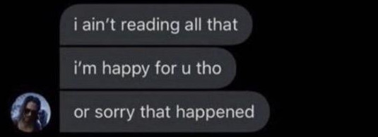
4. Walls of text
5. Popups on landing
There’s a time and a place for a popup and it’s not as soon as I’ve landed on your page. Instant bounce for me.
6. Long loading time
I have no patience and I’m going to assume that if your website is slow, your services probably aren’t up to scratch either.
7. Poor navigation
This is such a basic thing and it’s surprising how many people get it wrong. Why on earth would anyone think a nav bar at the bottom of the screen is a good idea?! Or hiding the menu altogether?!!!
8. Bad contrast
Again, I suffer migraines, stop making me try to read fuchsia text on a red background.
9. Not mobile responsive
No I won’t put my phone landscape and use zoom to look at your website, ever.
10. Forced full-screen mode
I’ve just encountered this today on something I actually wanted to sign up for, but the forced full screen was a big nope. I want my tabs there so I can click off easily to search for more info/other options, or to open another page of your site. I shouldn’t be having to remember which F button is the “exit full screen mode” one. Ridiculous. Middle management power trip vibes.